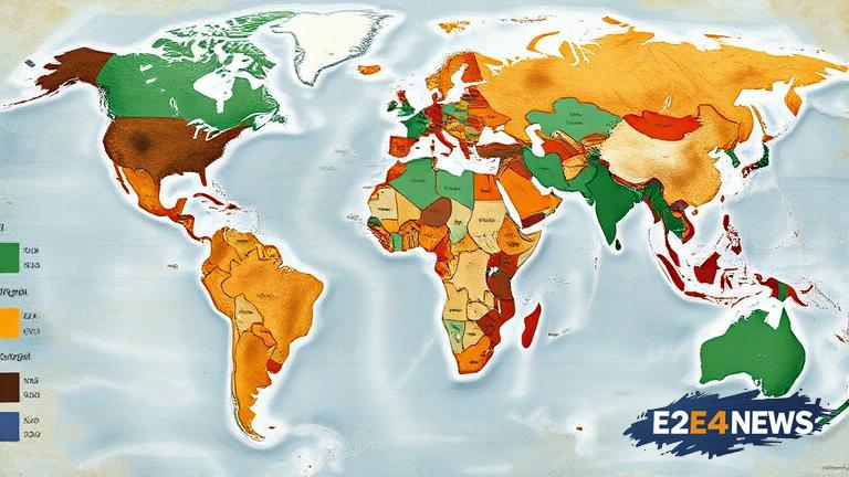
The world map, as we know it, has been a staple of geography and navigation for centuries. However, it has been revealed that this map has been distorting the size of countries, particularly Africa and India. The Mercator projection, developed in the 16th century, is the most commonly used map projection, but it has been criticized for its inaccuracies. The map shrinks Africa, making it appear smaller than it actually is, and exaggerates the size of European countries. This distortion has significant implications, as it can affect our perception of the world and its geography. For instance, Africa is actually 14 times larger than Greenland, but on the Mercator map, Greenland appears to be similar in size to Africa. Similarly, India is also affected by this distortion, with its size being reduced on the map. The reasons behind this bias are complex and multifaceted. One reason is the historical context in which the map was created. The Mercator projection was developed during the Age of Exploration, when European powers were expanding their empires and needed a map that would facilitate navigation. As a result, the map was designed to prioritize the needs of European sailors and traders, rather than accurately representing the size and shape of countries. Another reason is the cultural and economic dominance of European countries during this period. The map reflected the biases and prejudices of the time, with European countries being given more prominence and importance. The impact of this distortion is still felt today. It can affect our understanding of global issues, such as climate change and economic development. For example, the map can make it seem like Africa is a smaller and less significant continent than it actually is, which can perpetuate negative stereotypes and biases. Furthermore, the distortion can also affect the way we perceive and interact with different cultures and countries. It can create a sense of distance and separation between different regions, rather than promoting understanding and cooperation. In recent years, there has been a growing movement to create more accurate and inclusive maps. The Gall-Peters projection, for instance, is a map projection that more accurately represents the size and shape of countries. However, this map is not as widely used as the Mercator projection, and it will likely take time and effort to change the way we represent the world. The Indian government has also taken steps to address this issue, by promoting the use of more accurate maps in schools and educational institutions. Additionally, there are many online resources and tools available that allow users to create and customize their own maps, using different projections and data sources. These tools can help to promote a more nuanced and accurate understanding of the world and its geography. In conclusion, the distorted world map is a complex issue with significant implications. It reflects the historical and cultural biases of the past, but it also has the potential to shape our understanding of the world and its geography. By promoting more accurate and inclusive maps, we can work towards a more nuanced and equitable representation of the world. This, in turn, can help to promote greater understanding and cooperation between different cultures and countries. The issue of the distorted world map is not just a matter of geography, but also of culture and politics. It requires a multidisciplinary approach, involving historians, geographers, and cultural critics. Ultimately, the goal should be to create a more accurate and inclusive representation of the world, one that reflects the diversity and complexity of human experience.